Monday, 20 January 2014

My last tutorial before the holidays...


My Last Tutorial before the Holidays

I had three concerns before going into tutorial these were:

1.  I needed to find other method/techniques that would allow me to transfer my digital drawings onto a surface.

2.  When working bigger, what materials would I use? Acetate works for small-scale samples but larger acetate would not be long lasting and currently I want a single piece of material that can be etched to create folds to create 3-d net shapes but finding one thin enough yet strong is difficult, it also has to be transparent.

3.  Scale is currently a major issue, I want to create something large scale that aims towards a gallery space so it has to be large but I am unsure of how to achieve this, to work in multiples or work with separate pieces and then join them together to create one piece.

All of these concerns are holding me back from developing my visual samples further. I know I want to include my digital designs based on natural forms and connect them to geometric forms but finding the best combination is difficult but exciting to experiment. After tutorial and discussing these issues with my tutor and other students, I came up with starting solutions that would give me something to work from and develop:

1.  The new method of transferring my digital drawings onto a translucent material will be print medium. My specialism is print and I have been considering applying print from the start so now seems a good of place as any to begin integrating this within my final project. As I will be using clear materials it is incredibly important that my prints be created with a good quality finish so I have decided to use pigment binder, this will give my work a clean and clear finish with hopefully no watermarks.

2.  I gave material choice a lot of thought and without laser cutting them and working with the materials specifically it is hard to distinguish what would work. I decided to select materials that have the following qualities within them, they have to be thin, clear, and strong enough to hold shape and they have to be able to fold once certain lines are engraved. I have decided to start experimental work with thicker acetate and Perspex.

3.  Scale is something that needs to be explored, over the Christmas holidays I will experiment with multiples and working larger in singular areas that will be put together upon construction.

Other aspects to continue and be aware off:

1.  Decide and prepare digital drawings that I will want to print with, print twice on acetate, and do this process for four designs.

2.  Explore different formats and shapes.

3.  Prepare illustrator with net shapes that will be used on new materials for testing.

4.  If I am using multiples, consider how they would all attach together.

5.  Decide on a Live Brief, Humpties or Bradford.

6.  Re-look over my Learning Agreement.

7.  Make sure my blog and sketchbook are up to date.

Composition...

I found out about Soo Sunny Park through our PE presentations when someone else used her as part of their inspiration. I think Park's work was of particular interest to me because her work dominates a space, it fills a space with a striking presence and this is what I want my piece to entail, I want my work to dominate the space it is situated in. Park's work also seems geometrically motivated; her work contains many geometric forms that have detail precision within its structure, structures that are to a very large scale. I have been working with precision, structure and geometric shapes from the beginning of this project in small scale and now I have figured out where my context will work towards (gallery situated), I want to proceed with experimental work on a larger scale, whether working in multiples or singular (to be joined later on in construction). I have also been working from one sheet of acetate, to create and work on a larger scale, each side of a geometric shape could be created from one sheet, then attached together on construction to form a certain structure.
 

Park's work has inspired me to work much more loosely when forming a structure. I played around with some hexagon laser cut shapes that I then attached my drawings of natural forms onto; they produced looser structures that did not resemble any geometric form previously created. The images below show changes within precision and composition as there is not any specifics, this experimental work does not seem fitting with my theme of 'order and chaos', but taking this direction into consideration has made me aware of working bigger on construction with technical precisions being deeply thought about beforehand.


My Presentation...

My Presentation Review

When it comes to presentations and speaking out load in front of a group of people, I immediately begin to panic and this PE presentation was no different. As I was extremely nervous, I wanted to go in as confident as I possibly could so I rehearsed what I was going to discuss frequently the week before hand. I recorded myself a couple of times and listened to it back, it did help me to realise where I was lacking confidence and where I had little to talk about in reference to the images I had selected for the PowerPoint, I made all relevant changes. I also created trigger cards for self-reassurance in case I began to stutter or lose track of where I was up to. However, I think as I had major notes on the back of my trigger cards they became a distraction when delivering my presentation. I became more focused on reading what I had previously written rather than speaking to the audience directly, I noticed this negative a third way through the presentation, after I had noticed this I put the cards to the side and began focusing on what was on the screen and what I was discussing began to flow easier. Looking directly at the audience made me nervous so I did focus my attention more onto the screen than the audience, this is where my presentation could greatly be improved. At the end of my presentation, I felt as though I had literally ran back to my seat instead of standing firm and answering the questions put forward for me at the front. I was asked a couple of questions once I had sat down, I became more confident in answering them because I was sat down and it felt less formal. Presentations are my weakest area but preparing for them in more depth did help in general. I have been given good feedback from the presentation, I was told that I am able to clearly outline what has been going wrong in my practice, I spoke clearly and that I had good visuals which I was really impressed with.


Selecting the appropriate material...

I have begun working on how to incorporate the geometric shapes that I have been creating with my digital drawings of natural forms. The natural forms represent the 'nature' within my theme with the shapes created using laser cutting representing the 'man made'. I want to find a method of combining the two that would give me a professional finish. Laser cutting is an option but material choice would need to be taken into consideration as the thickness of a material can affect the result majorly, as seen below. I opted to use plastic because it was a transparent material, that was static and therefore strong enough to hold on a larger scale but with no flexibility available, the plastic had to be cut then attached together using glue, which resulted in a messier and raw outcome. I want my outcome in Unit X to be created from perfectly conjoined geometric shapes that have a clear professional finish, not a raw and unfinished-looking result.
 

However, I did experiment with these pieces with my natural form drawings printed on top, to allow me to visualise whether they would work bigger or not. I added small holes to the plastic, big enough to allow thread to pass through so that I could suspend the shapes in a similar style to that of Tomas Saraceno's work. I do not think this is a positive result, the triangles created look unfinished and cheap. By doing this experimenting, it has confirmed that for my final design samples and result, I would work with a flexible material so that perfectly combined geometric shapes are achieved to a professional quality.


Forming Ideas...

As my work has begun to develop, I have decided to aim my work in the direction that will aim towards a gallery-situated outcome. I decided to work towards a gallery-situated outcome because it allows me with the space needed to work on a much larger scale, it would also be the right setting for my work to be admired and appreciated by a variety of people.

I would like to produce an installation that will be consistently made up from the geometric forms that I have been working on. The geometric 3-d shapes will include my natural forms through the method of either laser cutting or print, as this is my specialism.

I want my installation to represent 'man made harnessing nature' instead of what is perceived as the human kind causing damage resulting in climate change. As the climate shifts, damage is being create upon the natural environment and through my method of laser cutting or print, I want to capture aspects of nature that are being damaged or overlooked and present them in a manmade setting that is consistent and would always be protected.

I know that my final piece that my Unit X will work towards creating an area that could possibly be walked under, it will consist of my geometric shapes, made from a transparent material combined with my digital drawings of natural forms. The shape and presentation of the outcome that I should be working towards is so far difficult to achieve, I began looking for inspiration through other artists work and their presentation of it as a way of generating ideas that I could then interpret myself.

Cerith Wyn Evans work is the inspiration for this idea. From the use of the bright light appears an uplifting, angelic and beautiful presence however, the glowing columns create presence by the sheer heat they project across the room, creating an unbearable heated atmosphere that can be 'deeply unpleasant'. Evans uses heat to portray the 'rage of desire', in opposition to the cool embrace given from upstairs, giving me a representation of heaven and hell. The simple presentation of columns is what I admire about this work; I wanted to visit the idea of using columns in my work through this drawing. I like the combination of columns alongside individually stacking my geometric cubes. I chosen to work with cubes for this design because of the simplicity they offer in being a even 6-sided shape, the natural forms would provide the detail.


Even though the stacked columns would provide me with a simple and elegant presentation, I want to produce a presentation that has more to offer within its construction. Jim Campbell in his work 'Exploded View (Commuters)', 2001 offers an idea on how to do this. I have kept the idea of using multiples in the back of my mind and this is where it came through, I like the concept of using multiples of one geometric shape all brought together to form the same shape but on a much larger scale, similar to that of Campbell's work presented below. The construction of a piece like this is difficult but the result would be worthwhile, the precision needed for this construction is what would represent the 'order' within my theme. For ideas like this to visualise, I need to work on the technical side of my shapes and how I would incorporate my natural from drawings on them i.e. print.  


Thursday, 16 January 2014

Experimentation- Laser Engraving...

Firstly, I wanted to experiment with engraving my designs of natural forms onto acetate because it so far had proved to be a positive and prospective material to use. However, my first attempt failed, I finished with a pile of burnt acetate because the laser did not engrave, it laser cut straight through the material because of the measurements I had applied to the setting. From this, I reset the settings, which resulted in a successful outcome, I did manage to engrave one of my natural form designs onto acetate, however the result was not as good as expected. The engraved design in some light is barely visible which was extremely disappointing as using acetate these were the either two ways the result was going to result in, both not promising outcomes.


As engraving onto acetate was unsuccessful, I decided to experiment with transparent plastics once again. The strength and thickness of the plastic worked better when engraving into it but the material itself lacks the fluidity that made acetate successful for working towards and creating 3-dimensional forms. Presently, material choice needs further consideration.


 I want my material to hold the specific elements of transparency, slight fluidity for bending and can be engraved or printed on.
  

A New Technique...

After going into tutorial with ideas of visualisations and prospective outcome ideas, it was suggested that I look at other sources of materials that could work better on a larger scale. Acetate works on a small scale and in multiples as a way of sampling but now, my visualisations are on a much larger scale than originally thought, material choice is becoming a prominent issue to consider. As my theme is of 'Order and Chaos', I decided to experiment with using the laser cutter in order to create specific measured shapes that I could then experiment with and represent the 'order' within my theme. 

I also wanted to use the laser cutter as another form of method to apply my drawings onto a material. Using the laser cutter also allows me to experiment broadly with material choice because the laser cutter can cut through most materials; it gives me extra room to explore. I find using computer applications difficult so using Illustrator to put my designs through to the laser cutter was a time-consuming process. After playing around with Illustrator, I created files that were successfully used on the laser cutter, these files produced simple cut shapes that were all sized consistently, and I even engraved into wood and plastic.


I did chose to work mainly with transparent materials such as Perspex and plastic because I wanted to carry on with the aspect of looking through what is created. I began experimenting with creating different forms and shapes from the laser cut pieces, working without a specific precision
or outcome is hard for me. I created some small-scale triangle pieces that do not fit precisely together but this works for the outcome, they are raw and interesting; I love the pieces when light flickers of them, and they remind me of diamonds. On a large scale, I would prefer these triangles to perfectly slot together to portray the 'Order' within my theme, I also would like my drawings to be placed on the material through the technique choice of laser engraving which would need testing and this is where my next step will begin.


Integrating the spider web form into my 3-d geometric shapes...

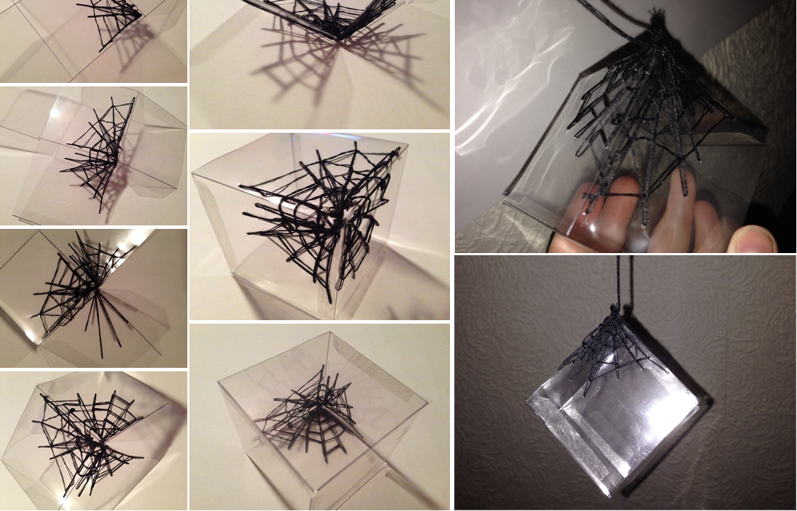
After looking at Tomas Saraceno's work and deciding that I want to integrate the spider web form into my 3-d geometric shapes that I have been creating, I started to experiment with this idea by sewing the spider web form directly onto them. The sample created is sewn on a clear acetate box that does not have any of my drawings printed on them so it does work well, however, if I did this web onto a 3-d container that has my drawing already printed on them, I do not think the combination of the two would work. The combination of the two may be too chaotic and distracting to one another that I would maybe consider using the spider web form differently.


I have been making individual containers that differ in size, shape and pattern but have always kept the vision of working with them in multiples in the back of my mind because I think near to the end; this is where my ideas will lean towards. I began to consider using the spider web form as a way of connecting a collection of these containers together to form an installation or maybe a gallery situated piece. I used the spider web form previously created and hung one singular container from it, this itself pulled the web heavily down, making me consider whether the idea of multiples being presented the same way would work. For this to be a reasonable outcome, I would have to put major reconsideration into material choice and scale.

I did begin to look at other alternative sources of materials that could make an interesting web but the outcome was not as expected. As I have said I wanted to become more free and loose with the web form, I decided that hot glue draping into the form of a spider web could create an interesting outcome. The decision to use hot glue to drape came from the work created and produced by Yasuaki Onishi. Titled, 'Vertical Emptiness', the outcome is purely beautiful. However, my outcome failed, the glue did not drape as intended, nor connect together, and I just ended up with clumps of glue sporadically positioned. I did find that the glue reflected shadows that could easily portray clear visible imagery around a room.


Natural form- Spiderwebbs/ Tomas Saraceno's Inspiration...

The spider web form was explored at the beginning of the research stage but it was overlooked during the sampling stage because I quickly moved on towards shells. I wanted to begin exploring the spider web form again but in more depth because after being recommended to look at Tomas Saraceno's work, I thought I had dismissed it too quickly. Digitally drawing spider webs are visually pleasing, they hold pattern and fits perfectly in my theme of 'Order and Chaos' as my digital drawings portray chaotic designs that holds the aspect of order within the spider webs construction, each web is connected together.


Using my drawings, I wanted to create a tactile version of a spider web, I decided to use black cotton thread as my only source of material for this sample because it is a flexible material to work with, it is thin and most resembles the qualities found in spider webs, the cotton also allows room for manipulation and control. I hand tied strings of thread to reach to this sample below. It was time-consuming but the photographs are worthwhile, they demonstrate a clear with my theme of 'Nature vs. Manmade'. Some of my photographs are exciting to look at because I do think they resemble what they were clearly inspired by.
 

Improving this sample and taking the spider web form further, I would experiment with the idea of threads alongside vanishing film in order to create larger samples; I predict that it would also give the spider web form created more depth and detail. Using the thread on a loose stitch on a sewing machine would also give me room to become free with what was being designed; I could become more chaotic and free.


Tomas Saraceno's work (above and below) with the spider web form has been a major influence in my working with spider webs; his work is fascinating, beautiful and incredibly detailed. Saraceno derives inspiration for his pieces from all sorts of things such as; soap bubbles, air dust particles and natural forms. Spider webs inspired Saraceno’s work at ‘The Venice Art Biennale, 09’, the scale is colossal and the presentation is simple and elegant, nothing takes away from his work. I admire how Saraceno uses the web to suspend and present his pieces, this inspired me to want to include the spider web form in my work as way of suspending my 3-d geometric forms.


Julia and Mark's Tutorial Notes...


After seeing Julie and her advising me that I need to become more decisive on my context, I began to consider where I actually want to see my work. As I am interested in installations, 3-dimensionality and light, these are the concepts my pieces will involve and work towards. To be decisive, I have decided that my work will be produced with a focused contemporary installation in mind. Maybe a type of light installation that; could become a positioned piece in a gallery space or functionally used as a chandelier of some nature. My theme of ‘Order vs. Chaos’, alongside ‘Nature and Manmade’ will still apply as some of my ideas already produced; inspire aspects that could work on a larger scale to become my intended outcome. After taking a week out of my project because of my essay, looking back through my project after this break gave me prospective on where I want my work to aim.

I was slightly nervous at the prospect of today’s tutorial with Mark. After taking some time away from my project, to complete my first draft of my dissertation, I felt lost with what I was going to continue experimenting with. As seen from my blog and sketchbook, I stopped working with acetate as I felt like I had exhausted all avenues and began working with paper. Using paper is where my original experimentation work started to inspired me to work with acetate, by going back to the start by using paper again; I was hoping it would supply further inspiration as to where my project will continue. I created a few samples from paper but using paper did not supply me with any further ideas, I felt like my work was going backwards instead of improving. I began to go through my sketchbook again to pick out samples that made the most impact and this seemed to help but going into tutorial, I still felt unsure of what my next steps were going to be.

After optional tutors and a dentist appointment, it has been 4 weeks that Mark had not seen my work, so getting his feedback was beneficial. Mark suggests to me that I should read and examine my drawings further as this was where all my experiments were at its highest point, they informed my structural work. As I want to begin working with materials, Mark suggested I experiment with the laser cutting but directly cutting out and engraving into a variety of materials. This is something that has interested me, I have been aware of the laser cutter for a while but I did not feel ready, until now, I am going to begin using some of my existing drawings and experiment with them on the laser cutter and engraver, experimenting with a variety of materials.

As I like the transparency that the acetate has provided, I am going to continue using acetate along with other transparent materials such as plastics and Perspex. I also want to experiment with fabrics but not in as much depth, I just want to experiment with material qualities to find the one that is appropriate for me. I visited Aidan, the laser cutter technician and he was incredibly helpful on where I need to begin with illustrator, time scale for each piece and material sizes for testers. By Monday or Tuesday, I am hoping to have a selective range of illustrator designs, taken from my drawings, which I will then go on to the laser cutter with. From here, I think it will provide me with a lot more ideas on materials, patterns, scale and structure, to experiment with and maybe help produce some visualisations that all lead the correct way.

Paper Light Shade inspired by Thyra Hilden and Pio Diaz...


After deciding to work with paper again, for further inspiration, I re-looked over my project so far, to gather old inspiration that could be explored in more depth. I began experimenting with the pattern that I had come across during research into 'architecture design patterns’; the pattern was constructed and hand carved to add extra detail to the architectural space that it was positioned in.

I wanted to combine this pattern with light and shadow, the two continual themes that have been running throughout my project. I created this sample from paper and as I anticipated, it held structure and the shape aimed for well, the light extracted through the cut pattern clearly, allowing shadows to be portrayed, this pattern did project around a room but not on the scale that I wanted. The nearer the light source and shade is to a surface the clearer the pattern is portrayed, the further it becomes from a surface the more indistinctive and blurry the pattern becomes.
 

The pattern being projected around a room clear is an important aspect of where this sample was aiming towards and because it does not appear clear enough, I am going to have to re-think on how it can be. I think using a thicker material or changing the scale may improve on the projection. I want a clear projection that would be on the same par as that of Thyra Hilden and Pio Diaz’s mystical forest inspired light shade is.


Wednesday, 20 November 2013

A New Direction- Paper...

After working on the acetate boxes for weeks, I decided that I wanted to change the direction in which my project was going. To do this, I began by looking back over my learning agreement and starting from there. I decided that I wanted to start using paper again as this is where my project began and where it side tracked off into acetate. Paper is a natural resource and would therefore be beneficial to my theme of ‘nature vs. manmade’. Some amazing pieces have been created from paper and after doing some experimenting with it, paper reacts brilliantly with light, better than acetate does. Paper blocks the light whereas acetate allows light to pass through it, because of this using paper would be more useful for me when working with light and reflections. Artists who have used the similiar aspects of; light, paper cutting and reflections have made some incredible designs.  

Julia Lohmann used laser cut dry pieces of seaweed to create this amazing lampshade. She used Kelp strips and then sewn them together. If the kelp was not in the shape she wanted, Lohmann would re-shape them whilst they were wet to create new and unique forms structures. The structures would then be placed around a rattan; Lohmann believes the rattan to be how the skeleton is to our bodies, the inner structure that holds the form.  Lohmann believes that seaweed could be used as a form of leather and other materials.

Sean Davies designed this lampshade as part of SketchUp; it was then modified for construction in Rhino. Created from six large sheets of strong paper, the pattern was cut out by laser cut and fixed together using fabric fasteners. Tilted ‘Lamp X’, I find this piece effortlessly beautiful, the reflections portrayed in the images are exactly what I am aiming towards creating, they are visually clear and the amazing reflections created add decoration to a room. The decoration aspect is important for me, as I do want my work produced to be visually pleasing.

 
Working with paper is going to be amazing. By just how my sketchbook is presented, I think it is clear that I am precise about particular things and working with paper is going to be one of these times. I like to present and portray precise structures that I have found through research and primary photographs. Sticking with the simple cube net shape, I began by cutting out my simple form of a shell. When working with paper cutting, I like to work small scale because I think it makes apiece look better because it has a lot of linear detail, especially when working from one structure, if I was to work with multiple structures, working larger would be necessary. From my photo’s it is clear to see that paper reflects shadows so much better than acetate.

Now, my experiments are rough samples, to give this sample a professional look and to experiment with scale, I would try-out with using laser cutting as it would save time and give the paper a better finish and professional finish like the examples below.


Installation Design...

As the triangle experiment went well, I decided to create another version of it using a different net shape and a different natural form. I chose to work with a cube net shape to create more layers and the natural form that I selected to work with was a set of leaves, which would demonstrate a clear connection with nature. I created more of these boxes than the triangles so that my composition and scale would be bigger. I projected these without attaching them together because at that moment in time I was not completely sure on what composition I was aiming for. When photographing them and playing around with the composition, I began putting them in order of size. Size in order would clearly demonstrate the order within my theme but as the two photographs below show this composition would not work, it is effortless to a fault. Playing around with composition and scale is definitely something that will become more apparent in my major project.

Once that I had made all of these boxes, I was not completely sure on how I was going to use them. My aim for my outcome is that it would either be an installation or interior based so for this collection, I wanted to turn it into a small-scale installation that would be suspended from the ceiling and that is exactly what I did. Seeing this up, I feel a great deal of accomplishment, I created something that I was finally proud of and it represented my theme of 'Order and Chaos' alongside 'Nature vs. Manmade'. The precision of the boxes represented the 'order' as well as the man-made, as they were created by me, the 'chaos' and 'nature' was represented through the natural forms printed on the boxes as well as the presentation.


On a larger scale I would like it to be presented similar to that of Susie Macmurray's work 'Echo' because her work is something I have always been drawn too. I think this is because most of her work is installation based and this is where my passion lies. Macmurray's work 'Echo' looks stunningly presented, it is a beautiful site-specific composition that is placed in what looks like a church. As it is so stunningly beautiful, I was surprised that her installation was created by using violin bow hair and hairnets, unusual materials. I would like my outcome to be similar to that of Macmurray's, I would achieve this by making my collection a whole lot bigger, Macmurray's installation consisted of 10,000 hairnets, so my collection would be time consuming but would hold the same effect of Macmurray's, this being the fragility and delicateness of the collection.


A New Direction...

This week I have taken the advice that I was given in tutorial about making a collection of my net shapes. I decided to limit myself to working with one net shape and one natural form so that the collection did not become too chaotic. I chose to continue using the triangle shape inspired by Laura Binyon’s work, which I had seen at last year’s degree show. Triangles are a simple shape to work with and they do not create too many layers that would blur the digital printed images any further.

My initial concern about the collection was there composition, so I re-looked over primary images that I had taken last summer for some inspiration. This is where I came across my primary images of Yoko Ono’s work at the Tate Gallery in Liverpool. Titled ‘Parts of Light House’, this beautiful cluster of 55 glass tetrahedral prisms inspired my own composition. It was inspiring because it fit perfectly with my theme of ‘Order and Chaos’, this composition in conjunction with the layers of natural form worked chaotically together, with the element of ‘order’ clearly presented in the individual triangles.

 
Working with light is something I have always enjoyed, I think this is because I think light makes my work look better, it highlights my works good qualities but will also show my works faults. In my tutorial it was said that the qualities of the LED electronic lights that I was working with wasn’t bright enough so I thought I would use the projector light to photograph my work on so that I could get brighter and clearer photographs. From looking at my images below and others that I have, the projector was a brilliant idea, the photographs are much brighter and clearer and they portrayed aspects that were not visually clear before now. It clearly portrays a 3-dimensional appearance, which gives my work the classification I was after. It also highlights the layers of natural forms, which are visible through each individual triangle. Using the projector has also defined my linear detailed digital drawings making them visually clearer, they appear bolder and they appear more literal. Whilst photographing my work, I became intrigued by the refection’s that were being projected. Using the projector abled me to view my work as 2-d and from another angle, the bottom. I like that some lines are defined bolder than others are, it adds to the quality of my work being 3-dimensional.
Using the projector gave me a lot more to consider, this sample could work 2-d and the scale could be much larger as the projector could attain that.

I decided to add some colour to my photographs and the projections by using colour jells that I had purchased. I chose to work with the colour green because my theme is looking at nature and the colour green is a clear element of it. I like that colour was brought into it but I think for now, less colour is better. Using one bright colour like the images show was too much, it reminded me off kryptonite, something I was not looking to achieve.

Whilst I was at the projector, I began playing around with changing the composition. Because of the fixing agent that I used to attach the triangles together, they could be moved; I exploited this quality and photographed other possible compositions. I like how the triangles can be stacked upon one another, doing this has made me give some thought into scale. So far, I have been working rather small scale with the odd larger scale model but I envisage these compositions on a large scale. A large scale that would tower over the audience, by doing this my natural forms would become abstract. With the light source being a constant feature on all compositions, different flecks of light appears, creating a rainbow of beautiful slight colour. This amount of colour does not ruin my work; it enhances it by giving it more detail, maybe this is how colour will play a role within my work. 


Development...


Some on my 2-d drawings and the work of Laura Binyon from last year's degree show inspired this experiment. Binyon used the same shape in her final piece and her composition and presentation was simple yet interesting to look at, her worked seemed to be installation based like mine but hers was also site-specific.
 

Each pyramid is made out of acetate with different forms printed on them, each representing a different aspect of nature. The acetate holds the pyramid structure well and visually presents the forms printed clearly, however, the acetate does slightly blur the forms reflections but I do not think there is another material out there that would not do the same.
 

Using a stronger light source may improve on this. Some forms work better than others do, the simple shell form is my favourite because the detail is linear, simple, pattern orientated, abstract and visually clear. I have not positioned them in any particular composition as of yet because I think there needs to be more of them.
 

Experiments...

 
Nature is visible almost everywhere. I created this experiment to convey this and present a sample to demonstrate a diversity of nature and its forms. It consists of three different sized acetate boxes placed within one another, demonstrating the idea that we are surrounded by nature. Each box has a different digital printed drawing on them to demonstrate the different elements found in nature. This experiment was small scale but I could imagine this being presented to an extremely large architectural space that allows the audience to move in and out of each box (room/space). I am intrigued that most of my interior aimed experiments have made me think larger in the form of architectural spaces.


This sample was created for experimenting with the material acetate and movement. All of my samples so far have been created with a certain precision in order to convey the 'order' within my theme of 'Order and Chaos'. The shapes created remind me of fish, I digitally printed a drawing I did of shells on the acetate surface, the individual structure of the pattern portrayed the 'order' within my theme as the height, width and colour was consistent, the composition is where I began to play around with the 'chaos' within my theme. At first, I began laying them out in a similar position to that of Claire Brewster's, 'Tropical Birds'. I found this layout to be too ordered so I began being more loose with the composition, by letting them lie where they fell, stacking them sporadically, placing them closer/further apart whilst recording it as I went along. From what was pictured, I could not see where these could fit within art, so I drew from them and what I drew gave me more of a composition idea than the actual pieces themselves did. The 'fish' positioned close together and attached would create an interesting sphere form, inspired by my digital drawing; it implies the aspects of flexibility and movement. From this, I could imagine this experiment leading onto a sphere shaped, interior light shade that would reflect the 'fish' shapes across a room.


I chose to work with paper and acetate in my experimental work because they hold structure incredibly well but as my experimental work progressed acetate became a prominent source for material choice because of its opaqueness but with that came acetate's faults, being that flexibility and movement was limited. This sample was about experimenting with these elements. I do like working precise but with movement and flexibility, the outcomes are not restricted. I find that flexibility and movement is not essential when creating my pieces but that it becomes an issue when considering composition, giving my pieces flexibility and movement limits the chance of breakages as it is made with change in mind. I chose to work with circles to add variety within my experimental work, I placed each circle slightly on top of each other to represent chaos from my theme, the repeated patterns printed on them, placed any way added to this also. As much as I like the option of movement in my pieces, I think it would limit my outcomes to 2-d and it is 3-d that I want my work to aim towards.


Monday, 18 November 2013

New Visual Research...

 
I decided to look at fruit for more primary imagery; some are naturally grown on trees making it appropriate to research. Each fruit has a unique structure within them, strawberries and kiwis have better structure within them to work with, as there is more detail. I began simply block printing with the fruit to create visually appealing patterns. In some of them, the pigments from the fruit ran into the ink adding slight colour detail, which was lovely and unexpected. It made me consider using delicate colouring in my work but I felt like I was not ready to use explore with colour. From the block prints, I digitally drew from them capturing the detail that I perceived and thought would make interesting abstract forms, the kiwi produced some linear constructions. I played around with the compositions of the prints and applied them to acetate.
 
Artists who have used fruit in their work before have mainly been painters who work 2-d; I want my work with fruit to be 3-d because that is what I want my outcome to be.

I began by forming 3-d net shapes again, as they worked so well before, this time I used the acetate sheets of fruit forms. I continued to use acetate because it allows the viewers to look through the net structures and using acetate reflects beautiful shadows. The fruit patterns formed the ‘chaos’ within my theme of ‘order and chaos’ with the precise net boxes forming the ‘order’. I made a number of these boxes that varied in shapes, sizes and patterns. I like that the patterns reflected are abstract and do not literally convey fruit, it adds a decorative look, which would be beneficial for me when working towards interiors. I find this beneficial because I want my work to be visually appealing and my fruit forms being more abstract than literal provides this.


Being that these experiments portray shadows, I think creating a collection of these would work brilliantly as an installation, especially if light was involved. However, realistically, multiples of these attached together would form a nice light shade that would be suitable for interiors. Doing this would create a lampshade that projects my natural patterns around a room, similar to that of Thyra Hilden and Pio Diaz but maybe not as visually clear.       


Thursday, 24 October 2013

Acetate 3-d forms...

I created these net boxes of individually shaped hexagons to look into making my previous experiments more 3-dimensional. As I have said before, I do like working to particular measurements and instructions because when followed properly, the results should look perfectly complete with a professional finish. However, when it comes to making 3-d shaped boxes using nets, my results have never been perfect and I find this frustrating. Using hexagon nets found on the internet, I created two different height sized 3-d hexagon boxes. The larger black hexagon box has a better finish that the white smaller one, maybe because of colour? Now I have found a way of turning this structured shape of honeycomb more 3-d, I want to experiment with them, focusing on the elements of materials, colour, pattern and size.
 
 
After using acetate for the beehive experiment previously and the material holding its structure and working so well, I thought I would use acetate to make some net hexagon boxes as I know it reflects shadows beautifully and reasonably clear. Instead of using the same honeycomb pattern as the printed pattern on the acetate beforehand, I decided to go back to my previous digital drawings of natural forms and use them instead for variety in pattern and forms. For my first hexagon net, I used a more detailed linear drawing of a beehive that did not have a precise mathematical layout. I am impressed with the results, more so because the material holds the hexagon structure so well. I like using acetate because it allows me to look through what is produced, it also when combined with light creates/reflects larger but more faded shadows of the natural patterns drawn.
 
Looking into spider webs is fascinating; they create amazing shapes and show incredible design and structure. Spider webs are viewed to be considerably small with a lot of time and effort put into creating the habitat. Before I viewed spider webs creepy and as a sign of spiders and dirt but looking at these drawings. I think the spider web shape would be interesting to work from, I can vision large suspended spider webs from the ceiling in paper, paper spider webs creeping through corners and maybe even using vanishing film with threads on a sewing machine would be interesting.
For this hexagon shaped net box, I digitally printed my spider web drawings onto acetate. In some area’s the shadows are just clumps of darkened shading because the print onto acetate was too dark which is disappointing. Doing this has made me realise that the smaller linear patterns drew create/reflect better shadowing. In this case, less is more.